Dyslexia Scotland has just been ranked 130th most awarded advertiser in The World Creative Rankings - sharing space with Kraft, Heinz and Apple. And no, they don’t have Don Draper on staff. Katie Carmichael tells us how they did it...
In 2022, we partnered with Innocean Berlin, rebels with a cause renowned for their disruptive social-marketing genius. The reason being, our pet peeves dovetailed perfectly.
Their problem was that there’s a lack of aesthetically pleasing dyslexia-friendly fonts for their accessibility-conscious design team.
For our community, the problem is that beautiful graphic design is rarely dyslexia friendly. (This is because dyslexic readers can be impeded by similar letter shapes, decorative fonts, some text-to-background colour contrasts, and line and letter spacing.)
We shared a vision for a better world: Roman alphabet typefaces that are both readable by the one in ten dyslexic people in the world, and also considered beautiful by designers.
The project
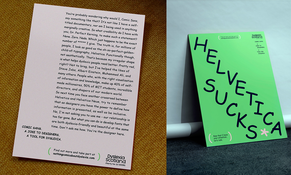
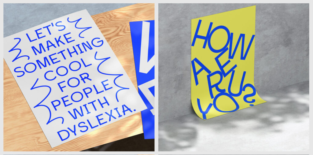
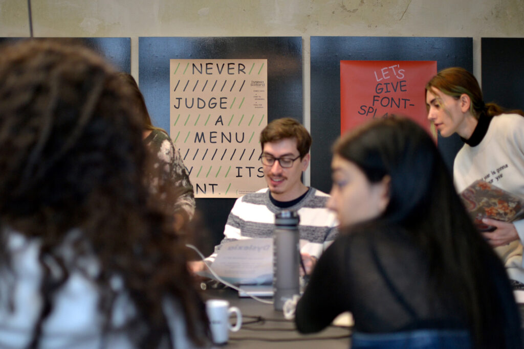
Graphic designers were the key to moving the needle, so we needed a direct and persuasive call-to-action. Along with Innocean Berlin, we devised a playful shockvertising campaign: messages to the design sector, personifying the much-maligned typeface, comic sans.
Loved by dyslexic readers for its unique and distinctive letter shapes and loathed by graphic designers for its wonkiness, comic sans is as divisive as Marmite.
The provocative campaign, (which took the form of social media, magazine advertisements, posters, personalised messages to design houses, and out-of-home advertising), made the case for accessible design: while dyslexia-friendly typefaces might be a joke to designers, there’s nothing comic about dyslexia. And designers could do more to make design that is both beautiful and accessible.
The call to action
The campaign set a clear challenge to the design community – design a new dyslexia-friendly typeface that looks good, too.
Creative copywriting cut to the heart of the issue, with comic sans pleading: “as designers, you have the power to be inclusive by deciding how information is presented. No, you don’t have to use me. But what you can do, is create fonts that are dyslexia friendly and give you a break from all that fontsplaining.”
The results
The message was noticed by the sector, getting a positive responses from around the world, even leading to file-sharing giant We Transfer profiling the campaign on their online walls.
Daniel Brokstad was first to rise to the challenge. The New York-based typographer gifted his time and talent to produce Inconstant Regular, A consistently-inconsistent-not-so-regular typeface created to be helpful to dyslexic readers and to designers alike because it can be tailored to individual preferences through its irregular shapes and built-in variable accessibility features.
Daniel explained: “inconstant Regular allows everyone to find their perfect mix between beauty and legibility.”
Design in the wild
Daniel’s creative solution has been a huge hit with the worldwide dyslexia community. A fan from Switzerland reached out to tell us: “thank you so much. I have dyslexia and I tried out Inconstant Regular – it is amazing. With this font, I can read 30% faster and I am not so tired when I read. I have never felt like this in my life.”
And importantly, There’s Nothing Comic About Dyslexia awoke the international design sector to the importance of accessibility.
As a result of the campaign, Miami Ad School, world epicentre of advertising talent, incorporated inclusive design lessons in their syllabus for the first time.
Closer to home, Birds of Paradise Theatre Company have incorporated Inconstant Regular in their new digital arts platform, built by Aberdeen-based design house Fine Day Studio.
What next?
Our recent accolade was the cherry on top of an exciting and impactful campaign, but we’re not resting on our laurels.
Our vision is for a dyslexia-friendly Scotland where our community feels accepted, included and valued and we work relentlessly to ensure that dyslexic children and adults have their rights met and are able to reach their potential. But it will take the whole country to fulfil that ambition.
Now that we’ve inspired the graphic design sector to be changemakers, we want other industries and professions will follow suit. What can you, your organisation or whole sector do for a dyslexia-friendly Scotland?
Take a leaf out of the Innocean Berlin playbook – go big, go bold and make change.
Click here to watch a video about the campaign
Katie Carmichael is lead for creative and digital at Dyslexia Scotland.