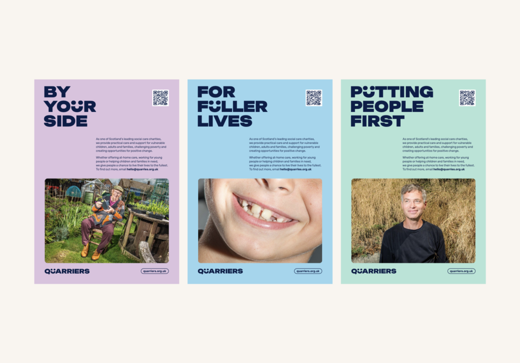
Its new strapline is: always with you, never without you
Quarriers, one of Scotland’s leading health and social care charities, has rebranded to reflect the charity's core values and long-term strategic goals.
The charity has evolved since its inception in 1871 to become one of the largest social care organisations in Scotland, with more than 100 services across the country.
Quarriers CEO, Dr Ron Culley, said: “We are excited to launch the new Quarriers brand. The current branding has been with us for more than two decades and life has changed; we are living in a digital age, and we needed a brand that could represent the organisation in 2023 and beyond.
“What hasn’t changed is who we are and our commitment to the people we support. We help people to live independently in their local communities, to contribute as citizens, to nurture the relationships that matter to them and to live their lives to the fullest.
“We have been working with colleagues from across the organisation to develop a brand that speaks directly to who we are and what we do. I think we have achieved that.”

The redesign was carried out by The Touch Agency of Edinburgh. It aimed to provide a brand that was engaging across all platforms and communicated all the incredible work that Quarriers does.
Martin Naylor, owner of The Touch Agency, said: “The new identity builds on strong foundations and harnesses the charity’s refreshed aims and values into a visual identity that is fresh, honest, inclusive and engaging across all platforms.”
The new logo plays on the inseparable relationship of the letters Q and U from Quarriers. The custom U character not only adds a friendly and approachable ‘face’ to the brand, but it also provides an opportunity for direct and memorable messaging. This is reinforced by the new strapline: always with you, never without you.
Ron Culley added: “Above all, we want the people we support, volunteers, fundraisers, and our incredible staff to know that it’s all about them, and we couldn’t do it without them.”


